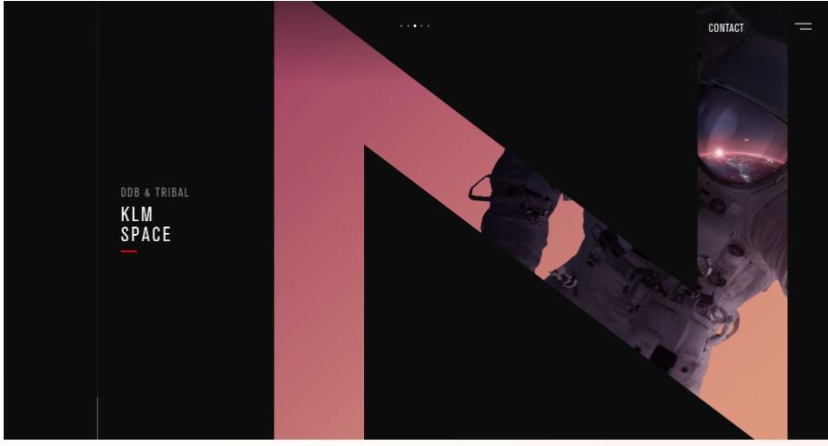
Choosing the right WordPress theme isn’t just about aesthetics—it directly impacts user experience, readability, brand positioning, and performance. In this article, we’ll explore the fundamental differences between dark vs light WordPress themes, along with their advantages, disadvantages, best use cases, and tips to help you decide which one suits your website best.
What Are Dark and Light WordPress Themes?
At their core, light WordPress themes use predominantly light backgrounds (white, pastel, cream), contrasted with darker text. This classic style emphasizes simplicity, readability, and a clean design.
On the other hand, dark WordPress themes how to use it for your website use dark backgrounds (black, dark gray, deep hues) with lighter-colored text, icons, and elements. They evoke elegance, drama, and a modern edge—popular among creative and tech-forward websites.
With increasing demand, many WordPress themes now support both, allowing users to toggle or auto‑swap based on preferences or system settings.
Benefits of Light Themes
Universal Readability and Familiarity
Light themes are time-tested. Most user interfaces—from books to web pages—use dark text on light backgrounds. This familiarity leads to easier comprehension, especially for long-form content or reading-intensive sites.
Brand Consistency and Simplicity
Brands aiming for clarity, minimalism, or professional tones (think corporate, education, news) benefit from light themes. They reduce distractions and focus attention on imagery, typography, and core messaging.
SEO & Load Speed Advantages
Light themes often translate to faster page loading since they tend to rely on fewer dark-mode specific CSS layers. Faster loading can positively impact SEO and bounce rates.
Benefits of Dark Themes
Eye Comfort in Low-Light Settings
Dark WordPress themes reduce glare and eye strain in dim environments—ideal for viewers at night or in low-light conditions, enhancing user comfort.
Stylish, Modern Aesthetic
A dark free WordPress theme comparison often highlights the visual sleekness of dark themes. They offer strong contrast for vibrant imagery, tech branding, portfolios, and gaming sites.
Battery Efficiency on OLED Displays
On OLED screens, dark backgrounds literally mean less energy used to light up pixels. This can be beneficial for mobile user experience and perceived performance.
Elevated Visual Hierarchy
Dark themes can make content “pop”—buttons, CTAs, and visuals stand out when set against a dark backdrop, strategically drawing attention.
Potential Drawbacks of Each
Light Theme Limitations
- Glare in low-light environments, which can cause discomfort overnight.
- Monotony: over-reliance on standard white layouts may feel bland without strong brand visuals.
Dark Theme Limitations
- Readability issues: poor contrast or color choices can reduce readability—especially for long text blocks.
- Accessibility traps: setting wrong color contrasts can alienate users with visual impairments.
- Content compatibility: embedded media, images, charts, or embeds may not look as polished on dark backgrounds.
When to Choose Dark vs Light Themes
Ideal Use Cases for Light Themes
- News, blogs, documentation: Extensive reading benefits from high contrast, low distraction.
- Corporate or educational sites: Builds a trustworthy, clean, straightforward atmosphere.
- E-commerce & product catalogs: Highlights product shots and details with minimal visual noise.
Ideal Use Cases for Dark Themes
- Creative portfolios: Photographers, designers, artists showcase color-rich visuals most effectively.
- Tech & gaming: Dark aesthetics resonate with innovation and modernity.
- Niche media: Music, cinema, or fashion platforms benefit from moody, immersive styles.
UX, Accessibility & Readability Considerations
- Color contrast ratios: WCAG requires a contrast ratio of at least 4.5:1 for regular text and 3:1 for large text. Ensure both light and dark palettes meet these standards.
- Font weight & size: Light-on-dark can strain readability—adjust with bolder fonts or larger sizes.
- Focus states & hover styles: Visual cues like borders or color changes must be clearly visible in both modes.
- System preferences: Many users default to dark mode. Integrate CSS media queries (prefers-color-scheme) for theme auto-switching.
SEO and Performance Implications
- Page Load Speed: Excessive dark-mode switching can lead to added CSS/JS, potentially slowing load time.
- Page Experience Signals: Mobile viewing, stable layouts, and responsive dimensions—regardless of theme—impact Core Web Vitals.
- Replayability & Dwell Time: Themes that reduce glare or fatigue may increase session duration.
- Structured Content & Semantic HTML: Theme color doesn’t substitute for well-structured content—proper headings, ALT tags, meta descriptions, etc. remain vital.
Tips for Implementing Either Theme
- Test contrast levels: Use contrast-checking tools like WebAIM’s analyzer.
- User testing: Survey real users in various lighting environments.
- Accessibility plugins: Tools like WP Accessibility can check compliance.
- Combine gradients or lightemphasis: In dark themes, use slightly lighter backgrounds for large text sections.
- Consistent imagery: Choose visuals that complement both themes or adjust them dynamically.
- Performance auditing: Use GTmetrix or Lighthouse to ensure fast load times with both theme styles.
Hybrid & Adaptive Theme Techniques
- Theme toggler: Allow users to switch between dark vs light WordPress themes with manual buttons or system sync.
- Auto switch via CSS:
@media (prefers-color-scheme: dark) { body { background: #111; color: #eee; } }
- Dynamic CSS injection: Serve minimal CSS by loading theme-specific styles only when needed.
- Prefetch contrast mode: Load and cache both styles but activate only the style the user chooses to prevent FOUC.
Final Thoughts
Ultimately, choosing between a dark vs light WordPress theme comes down to:
- Your audience’s needs (reading patterns, environment, preferences)
- Your brand’s aesthetic and emotional goals
- Accessibility and performance commitments
- How well your content—text, visuals, videos—integrates with the chosen palette
No matter which route you go, remember to test thoroughly: check contrast ratios, gather user feedback, and measure engagement metrics. And don’t overlook the value of flexibility—a toggle switch can offer the best of both worlds for your audience.
For those searching the web for Dark Vs Light WordPress Themes: Which One Is Better for Your Website?, remember: you don’t necessarily have to pick one. With intelligent implementation, you can deliver an optimized experience that adapts seamlessly to every visitor’s context.


